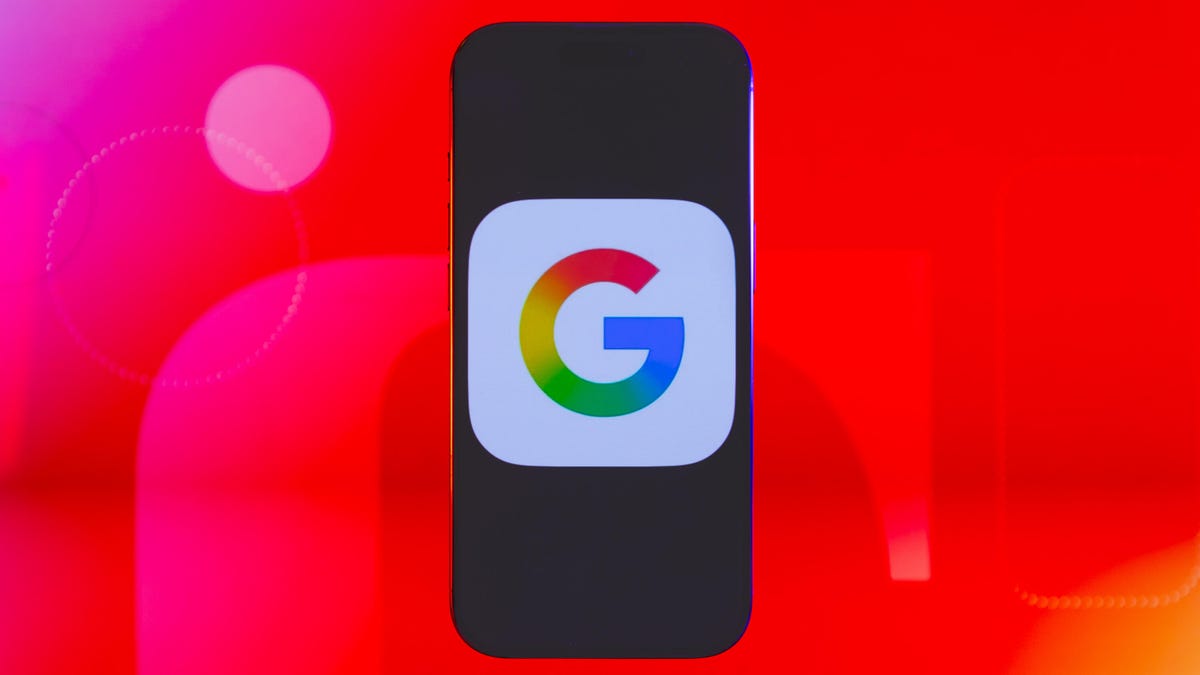
Google has updated its “G” logo after nearly 10 years, according to a report from 9to5Google on Monday.
The new logo has a gradient effect when transitioning between colors, whereas the previous version separated Google’s iconic red, blue, yellow and green color scheme into blocks. The updated logo is appearing on the Google Search iOS app store page. 9to5Google reports that the updated icon has landed on Android with Google app 16.18. The Google logo hasn’t been updated everywhere else yet.
A representative for Google didn’t immediately respond to a request for comment.
Best Laptops of 2025
The last time Google updated its “G” logo was back in September of 2015. As Google puts AI at the forefront of its product portfolio, it seems that a new iconography is coming along with the changes. Google Gemini, the company’s generative AI assistant, uses blue-to-purple gradients in a diamond-star motif. The six-letter Gemini logo also uses a gradient. While Google’s iconography has often stuck to bold reds, yellows, greens and blues, the change could be an attempt to better sync design between Google and its AI products.
Google’s Gemini logo uses blue-to-purple gradients.
Read the full article here


