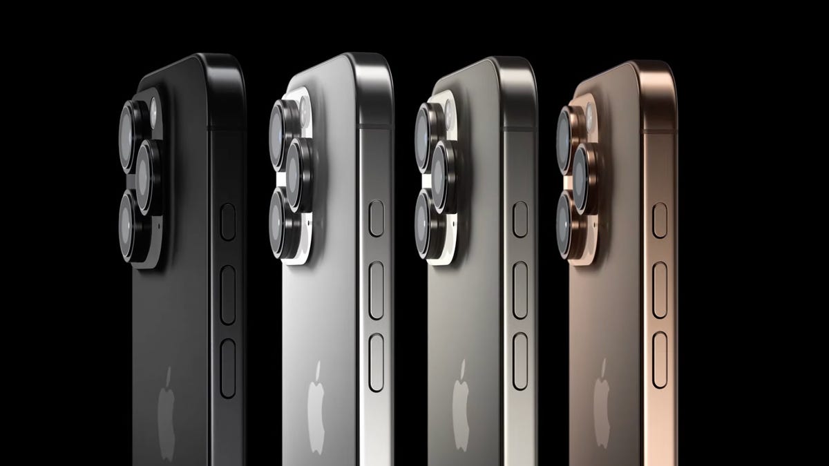
Sure, a lot of people wrap their new iPhone in a case but I’ve always cared a lot about how my smartphone looks. And for the iPhone Pro line, the colors have historically been muted. So when I saw rumors that the iPhone 17 Pro could arrive in colors such as orange, I started dreaming about a world where Apple’s best phones exude a sense of fun like their siblings.
For years, Apple has split its phones into two tiers: the “regular” iPhones and the Pro models. The former offer lower specs and prices with bolder colors, while the latter are pricier premium models with more subdued tones. The iPhone Pro and Pro Max typically come in black, white and a silver-gray — along with one trendier color that changes each year. For being the best that Apple offers, their colors leave a lot to be desired, in my opinion.
But the iPhone 16 Pro comes in desert titanium, which is gold in all but name. The year before, the iPhone 15 Pro was available in a gray-blue (which I remember well, if not fondly, for not matching my vintage Bondi blue case). In 2022, the iPhone 14 Pro left white behind for gold and added a pastel purple alongside its black and silver hues — and so on.
Some people dropping $1,000-plus on a souped-up iPhone Pro want their device to look svelte, not superlative — elite over effervescent, cultured instead of colorful. I’m not that person. When I saw the iPhone 5C, I didn’t mind the cheaper-looking plastic case — the vibrant colors popped. I don’t think buying a premium phone should sentence you to a purgatory of dimmer hues.
And yes, there are those of you out there who don’t care what your phone looks like, because its colors will only briefly see the light of day before the handset is stuffed in its case to survive life’s inevitable bounces and falls. That’s completely valid, too.
So hearing that there’s a potential Liquid Glass color coming to the iPhone 17 Pro that we expect to launch (as we do every year) in September, I got tentatively excited. But there’s a big caveat: The rumor, sourced to Weibo-based leaker Instant Digital, didn’t include a photo or any imagery of this potential debut. Instead, the leaker suggested that (as translated by Google Translate) the iPhone 17 Pro color is expected to be white, but with a finish that shifts or changes subtly under different lighting conditions.
The baseline iPhone 16’s rainbow of colors.
Where are my prismatic phone colors?
Apple introduced its Liquid Glass update during WWDC 2025 in June, unveiling a new design strategy for the iPhone 17 Pro line that emphasizes translucence and rounded icons to give iOS 26 a fresh UI facelift. App makers responded to the initial developer betas with disdain, criticizing the design’s distracting and disorienting lack of visual separation — icons in the Control Center overlay were hard to see. Thankfully, subsequent tweaks improved the redesign ahead of the recently launched iOS 26 public beta.
But how Liquid Glass’s design looks as an iPhone color is a bit harder to fathom. Instant Digital’s claim that it’ll be white but will shift with the light offers clues — and it could end up looking like some beloved colors from smartphones of yore.
For instance, the 2018 Samsung Galaxy S10 came in a rather fetching prism white color that shimmered when you rotated it in the light, giving off a pearlescence of subtle pinks, purples and blues. Watch how it compares to the standard cream-colored ceramic white hue in this video from Sakitech.
Contrast that with the more wildly prismatic “aura glow” color in the Samsung Galaxy Note 10 from the same year, which reflected every color of the rainbow. This bombastic choice sure was eye-catching but I’d guess it’s too flamboyant for Apple. (And the beautiful glass back sure couldn’t stand up to a fall.)
True, Apple has dabbled in subtly shimmering colors — the iPhone 13 and 13 Mini came in midnight, a black so deep it was almost blue, reflecting hints of hidden hues underneath. That same year’s iPhones had another color, starlight, that was essentially the same effect in white.
But looking more closely at iPhone Pro designs from past years, I doubt we’ll see anything as vivacious as those Samsung hues — not only because Apple has avoided vibrant colors, but also because in recent years it’s used a frosted rear glass that blurs and mutes the color beneath. Just what we end up getting from a Liquid Glass color, if anything at all, is very uncertain given Apple’s design priorities.
But I’m hoping, just this once, the Pro phones get to show off a bit more of their stuff. And who knows — maybe that’ll be what finally sells us on the upcoming Liquid Glass redesign that’s set to change the look and feel of iOS, like it or not.
Watch this: iPhone SE 4 vs. iPhone 17 Air Rumors: Does Size Matter Over Cost?
Read the full article here


